Cover
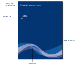
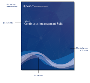
The layout below is of the front cover for Salient Management Company Brochures etc. The layout for the cover has a logo, title, blue background, and the blue waves. The placement should be in the same position as the one below.
Back Cover
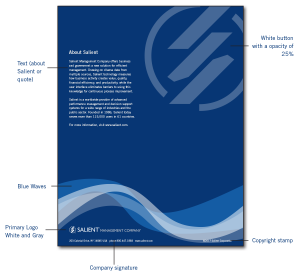
The layout below is of the back cover for Salient Management Company Brochures etc. The layout for the cover has text about Salient or quote, copyright stamp, company signature, Salient logo white, blue background, and the blue waves. The placement should be in the same position as the one below.
Page Layout
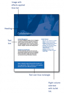
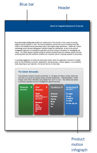
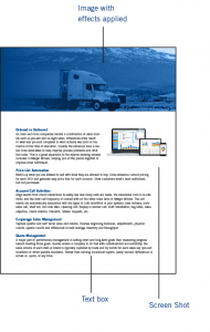
The illustrations below are examples for Salient Management Company Brochures etc. The layout has an image with the blue overlay or white overlay or a solid bar for the heading. Main body text and text should be aligned left. The text in the box should be aligned left; there could also be a text box in the right column. The placement should be similar as the one below. The size of the blue bar and the layout will depend on the document; make sure that it is coherent to the whole document.
Case Study
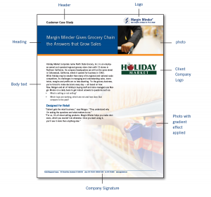
The Illustration below is for Salient Management Company’s Case Study. In the example the header has the name aligned left and the logo aligned right. Followed by a blue bar with the title and an image under is an orange bar. The main body has different layers; the image with a white feather gradient, text aligned left, and the Client Company’s logo. The footer should have Salient’s signature.
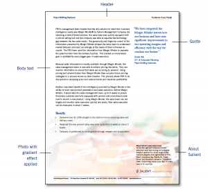
The Illustration below is for Salient Management Company’s Case Study. In the example the header has the company’s name aligned left and the case study aligned right. The main body has different layers; the image with a white feather gradient, text aligned left, and a quote from the company. The right column near the footer should be the statement about Salient and the logo and footer should have Salient’s signature.
